People fear change and in the technology world it’s even worse. Apple’s iOS software has looked and performed in the much the same way for several years and so making radical design changes is a big risk. The Cupertino company revealed iOS 7 for the first time last week and we’ve dived in for a look around the first beta of the new software.
Thanks to our developer buddies over at App Developers UK we’ve got iOS 7 beta 1 loaded up on our iPhone 4S, ready for us to explore. Almost everything is different in iOS 7; from the icons to the colours to the lock screen.
Lock Screen
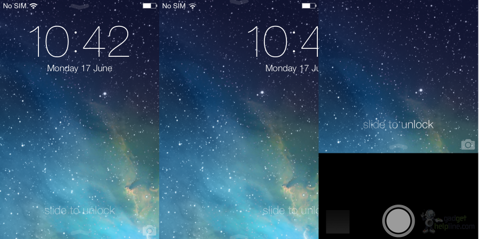
We’ll start with the lock screen, where Apple has mysteriously dropped the ‘slide to unlock’ mechanism that it has used since the very first iPhone and has subsequently sued its rivals for copying. You still unlock the iPhone by swiping from left to right (anywhere on the screen), but the slider is gone and there’s no prompt. Arrows point down from the top of the screen and from the bottom, which will likely confuse some new iPhone users, but these are hinting you revealing the Notification Centre and Control Centre respectively.
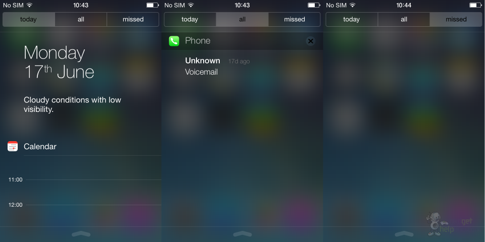
Notification Centre
The Notification Centre has been made over, now offering tabs at the top which filter notifications into all, ones from the current day only and those you have missed. Above your notifications is now a day summary which shows the date in large text and below a brief summary of the weather in your area. Overall it’s simplified and far, far less cluttered.
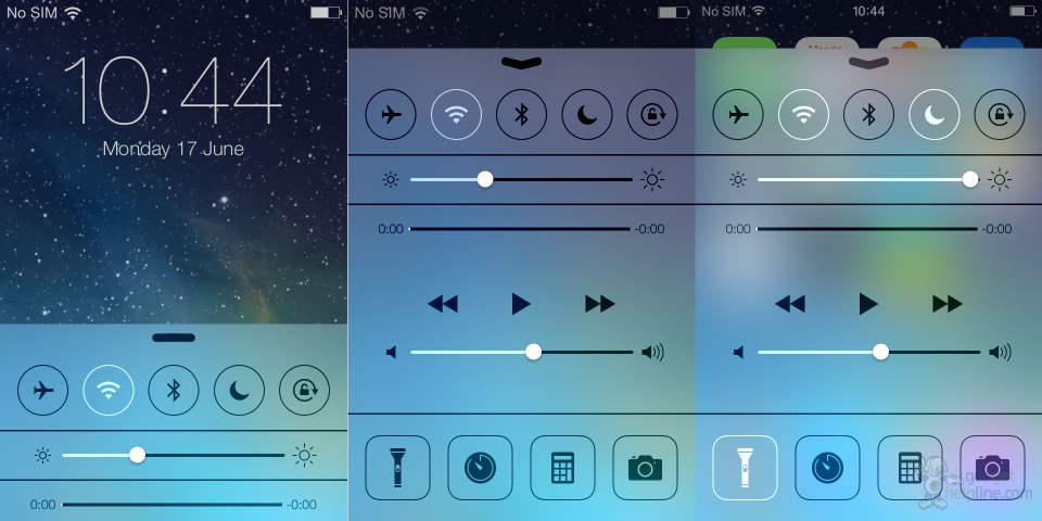
Control Centre
Swipe upwards from the bottom when anywhere on the device and you’ll get one of iOS 7’s big new features: Control Centre. This is a feature that the iPhone has been crying out for and something that Android has offered for years. In here you have toggles to turn things like Wi-Fi, Bluetooth, Airplane Mode, Auto screen rotation and Do Not Disturb on and off. There’s a slider for screen brightness, controls for music playback and shortcuts to your alarms, Calculator and Camera apps and also a flashlight. When I had an iPhone 4 this was something I wanted so much that I jailbroke my device to get, so it’ll be interesting to see whether jailbreaking continues to be a popular practice when iOS 7 launches later this year.
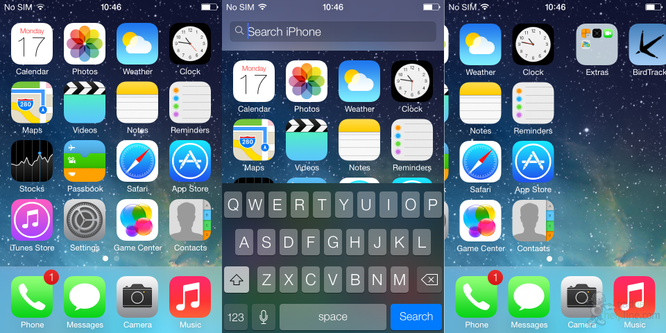
Home Screen
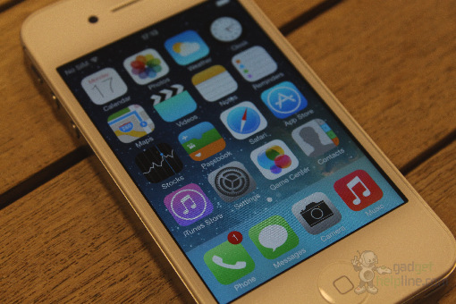
Swipe left to right to unlock the device and you’re presented with a home screen which is both familiar and alien. Every icon has been redesigned, the fonts are different, the black status bar at the top is now gone and the mobile network signal is shown in circles rather than steps. Apple waxed lyrical at WWDC about a new ‘parallax’ effect on the home screen and this can be seen by tilting the phone around. The background moves as you tilt the device, giving the effect that the icons are floating above it with a 3D effect. We believe this feature uses the device’s accelerometer to tell when you tilt the device, so in theory more battery will be used up – we’ll need to test further to find out whether that’s correct or not.
Universal search has also been changed so now you simply swipe downwards from any home screen to reveal the keyboard and the search bar. Nifty and much easier to get to than the old method!
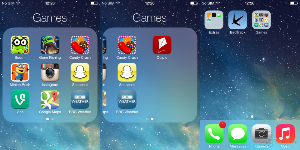
Folders with pages
Folders have been upgraded and you can now add more than 12 apps (16 on an iPhone 5). When you add 10 or more apps in a folder you will then then be offered an additional page to continue adding apps. These pages can be scrolled between horizontally once in a folder, like you would do with the home screens. There’s more of a focus on folders in iOS 7 it seems, indicated by the way that they now open full screen rather than as a smaller drop-down below the original folder icon.
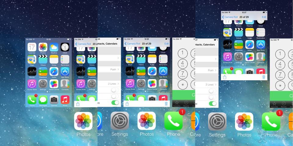
Multitasking
Apple has ditched the old multitasking method, replacing the somewhat convoluted process of closing apps with something much more simple and fluid, albeit an idea borrowed. You still view your open apps with a double click of the home button but in iOS 7 apps are presented as large tiles which you flick through from left to right. A swipe upwards on a tile will close the app – a method which is used on Android and before that was first shown on the Palm Pre. The screen itself looks very much like the multitasking page of Windows Phone, too. That said, it’s pretty slick and far better than the wobbly icons trying to tap those tiny crosses to close apps in previous versions of iOS.
Camera app
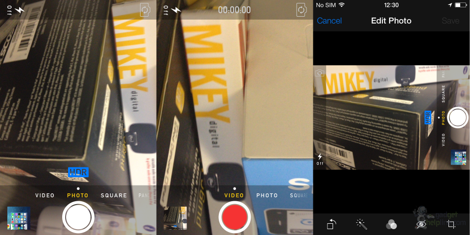
The camera app is again completely different, with Video, Photo, Square and Panoramic modes available at the bottom. You swipe through these from anywhere above the shutter button on the screen, which is now a large white circle – red when recording video. Options for flash and camera switch are found in the top left and right corners respectively, whilst HDR is a toggle button located just above the shutter button. It might be our imagination but images seem to capture faster, although unfortunately an image capture is still only signified by a brief flash in the bottom left corner of the screen – this animation but full screen would be much nicer, please Apple.
It’s clear to see that the popularity of Instagram has been considered, with the addition of a ‘Sqaure’ photo mode and a selection of filters to choose from complimenting the popular photo sharing app nicely. There’s also support for zooming whilst taking a video and a pretty neat photo editor which allows you to crop, remove red eye, auto touch-up and do more with your iPhone snaps. It’s not the most advanced editor but it offers enough for the average user to sort out any iffy snaps in a minute or two.
Music and Video
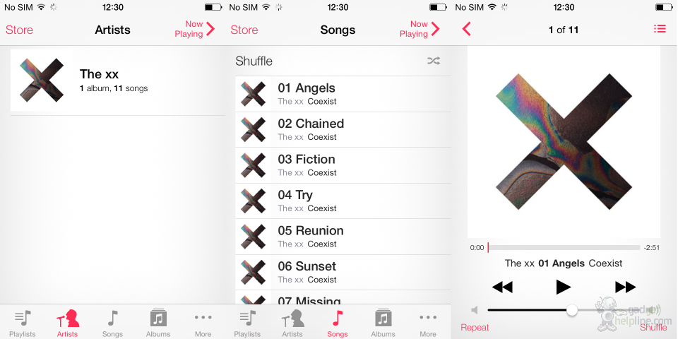
The new iTunes Radio is unfortunately not yet available in the beta version of iOS 7, so we’ve not had a chance to have a play with it. However, the new Music app layout is there and working. The app is very white with red icons and text, offering the same Artist, Songs and Albums views along the bottom. The Now Playing screen looks pretty slick and simple and we definitely prefer it to the older versions which seemed comparatively cluttered.
Safari
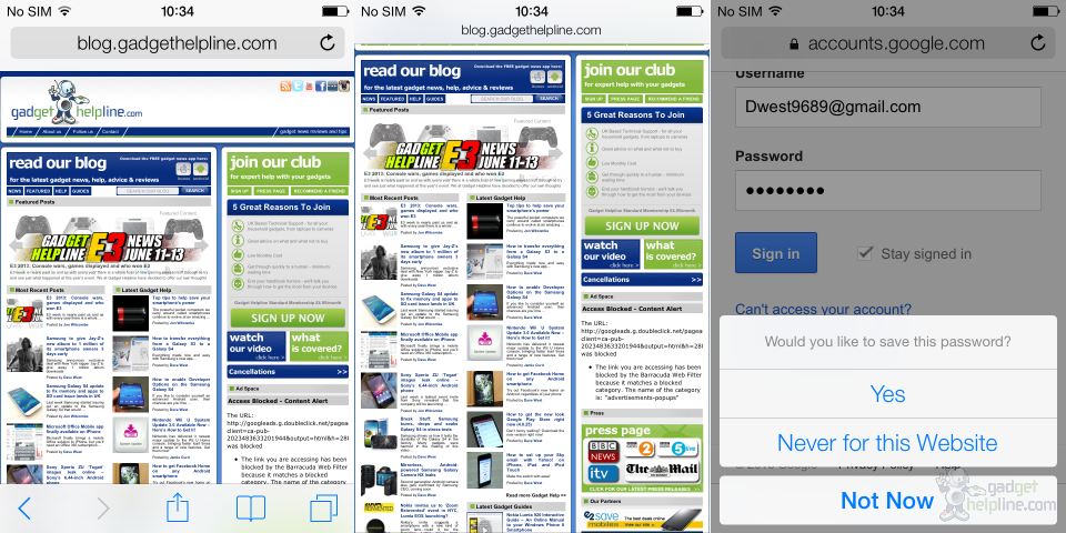
Safari has been upgraded with a number of new features as well as a design to match the whole OS. It’s all very white and minimalistic, with the address bar and bottom options bar now automatically hiding as you scroll down so as to provide as much of a full screen browsing experience as possible. The address bar is now a combined URL and search bar which is pretty handy, whilst the options at the bottom of the page offer Back, Forward, Share, Bookmark and New Tab options. You’ve also got the new iCloud Keychain feature which encrypts and saves your login and card details for individual websites – this pops up with a simple request at the bottom when you log in to a site or service for the first time.
Siri
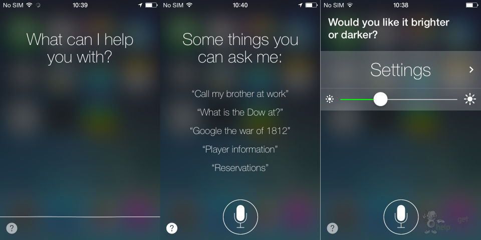
Apple’s voice assistant has a new look to its app, with the background now offering a pretty cool blurred view of your home screen layout, making Siri seem like a temporary layer over the homescreen rather than a whole new app that you’re taken to. There’s a pretty cool wave effect going on at the bottom which reacts as the internal mic pics up sound, and your request to Siri is displayed in a much more basic yet conversational way. Siri has learnt some new tricks too, such as “increase the brightness”, which can be done bit by bit, and some immediate actions such as starting a FaceTime call or opening an app.
App Store
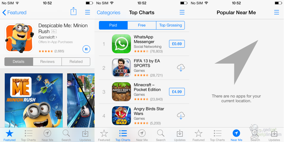
The App Store follows the same white and grey colour theme as the rest of iOS, albeit with a huge splash of colour added by the hundreds of thousands of apps on offer. There’s a new option at the bottom for ‘Near Me’ which uses GPS to find other iOS users near you and show you which apps they’re installing. This didn’t work for us but we can see it being pretty popular for finding new apps whilst you’re in a coffee shop, for example. Pausing an app download is now easier thanks to a small pause icon placed in the app view screen, with the download progress circling around it like a Sky+ icon. Apple seems to have worked to make sure you can quickly download a number of apps without having to actually leave the App Store, which is nice.
Conclusion
iOS 7 is very different to anything before it and we can see a large portion of the iPhone-using public causing uproar when it lands on their devices. However, after a few days with it we’ve come to enjoy the refined interface. The large amount of white used in some apps can become a bit of an eyesore and there’s clearly a number of aspects and features borrowed from rivals which will no doubt bother the dedicated Apple fans out there, but it’s certainly the change that Apple needs after years of the same look.
iOS 7 will launch later this year as an upgrade to older Apple devices. We expect it to launch around September/October time, alongside the new iPhone.
Source: Gadget Helpline
